JL DESIGN Perspective|How Logo Design Concepts Create Brand Value
Date:2024-08-26
JL DESIGN believes that a good logo design concept can reveal layers of meaning upon closer inspection, with each layer speaking to the brand’s value. Art Director Kevin Chien discusses how helping brands find their perspective is the core and value of design. Kevin continues, “An excellent logo not only needs to be identifiable but also adaptable to various application scenarios, serving as the connecting center for all touchpoints, constantly conveying the brand’s core values.” The team uses interviews, workshops, and other interactive methods to deeply understand the client’s interpretation of their brand, naturally embodying the brand spirit through details like lines, colors, and style, rather than constructing a design narrative afterward.
Brand Renewal from Scratch
In January 2022, the long-established securities firm Daqing Securities officially rebranded as Good Finance, with JL DESIGN responsible for the brand identity renewal. The design team embedded themselves within the company, working closely with the brand team to explore and delve into the brand from a close perspective, starting from scratch to investigate and conceptualize, distilling the unique brand warmth of Good Finance. “We uncovered issues through daily conversations, understood each other’s values, identified problems, and reached consensus. The whiteboard in the meeting room was filled with traces of brainstorming, and through each divergence and convergence, we extracted key words while simultaneously working on sketches and visuals, continuously refining our focus,” Kevin recalls.

“Finance is a vast industry, yet it’s closely intertwined with our daily lives; only when we don’t take this for granted can we design a logo that isn’t taken for granted.” — Art Director Kevin
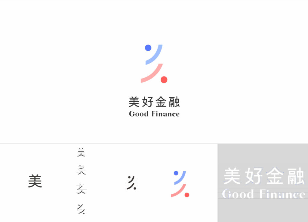
From afar, it resembles the Chinese character “美” (beauty); up close, it appears as the image of a standing person and a humble person; upon closer inspection, it’s a person’s hands cradling an object, reflecting Good Finance’s attitude towards client assets. Complemented by “blue and warm orange” colors symbolizing financial expertise and warm service style, JL DESIGN helped Good Finance break away from traditional impressions, creating a people-centric brand image that coexists with life and walks alongside people. From concept to final approval, Good Finance’s logo took nine months. Creative Director Johan Tsai believes: “Logo design needs to support vast brand connotations. Our goal is to make the logo, when deconstructed, become the brand core and create brand continuity.”
From Local Characteristics to Global Vision
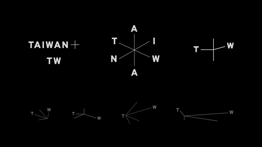
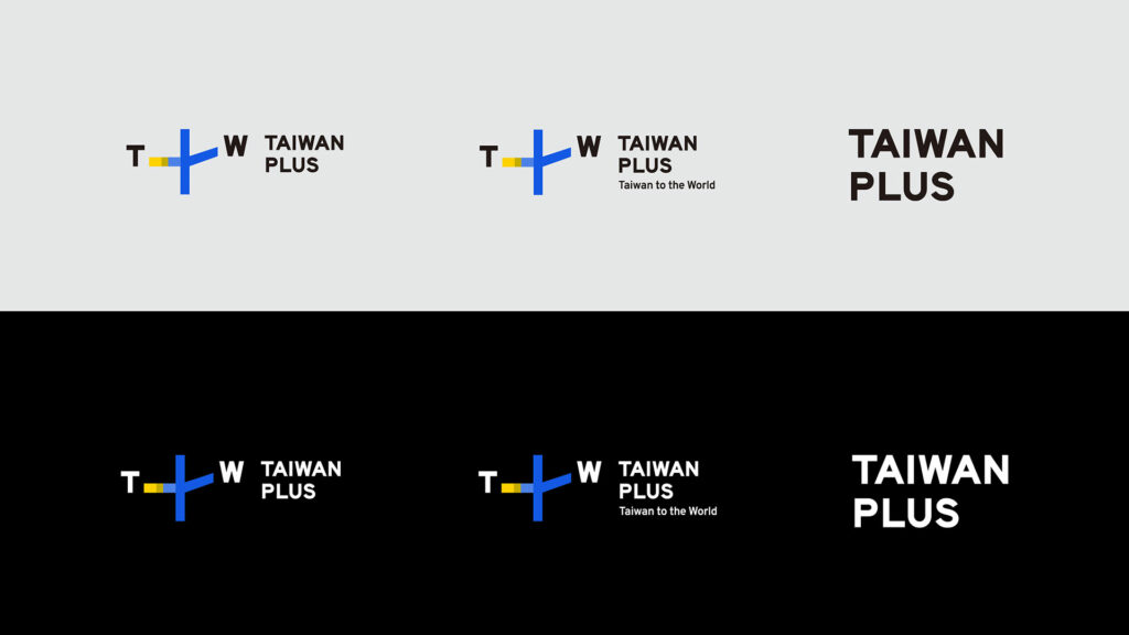
Besides letting the logo tell its own story, “symbols with stories” is also a focus for JL DESIGN. In the TaiwanPlus project, Taiwan’s first streaming platform facing an international audience, “We had to help the client face the global stage. The logo uses the concept of intersection as its core, showcasing Taiwan as a hub for flow, exchange, and energy transmission,” Johan continues, sharing the logo design concept. The font chosen for TaiwanPlus is full of locality, inspired by the abundant road signs you’ll definitely see when you come to Taiwan. When we feel dissatisfied with the chaotic road signs filling Taiwan, conversely, isn’t this young Taiwan in the process of growth? How to transform the public’s first impression of chaos into Taiwan’s core concept of an outward “channel” – the starting point of Taiwan’s intersection with the world – this is the value JL DESIGN tries to convey through the logo.
|Further Reading|
► TaiwanPlus
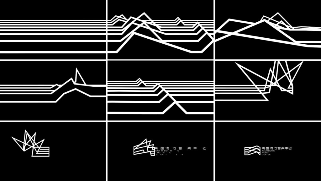
The team’s significant time investment in logo design perfectly demonstrates our ability to accompany clients in exploring their brand’s core values. Kevin uses the logo design for Kaohsiung Music Center (KMC) as an example: “At that time, Taipei Music Center had already established a first impression in the public mind. So how should JL DESIGN articulate the brand of KMC, which is also a city music venue?” The team conducted field research, interviewed Taipei Music Center, and clearly understood the background and positioning of both venues. “Because it was a big topic, we started by exploring the connection between the city and music, such as local singing halls or music that emerged from urban culture. Through this understanding and deep comprehension of Kaohsiung’s musical essence, the design gained many new perspectives,” Johan adds.
Finally, the team chose to highlight the characteristics of the KMC venue, “Not only as a music venue but also embodying Kaohsiung’s culture and local sounds; like musicians looking at the waves and feeling the sea breeze, creating their own melodies.” Johan states that the logo’s straight, bold lines are closer to “the first sound emitted,” “It might not even have been polished yet, but it’s full of vitality.” This vitality extends through the variation of the staff, presenting wave-like lines that can be constantly recombined and varied in multiple visual presentations, forming an organic logo, gradually establishing KMC’s unique image.
|Further Reading|
► Kaohsiung Music Center
Diversified Visual Systems Redefining the Possibilities of Logos
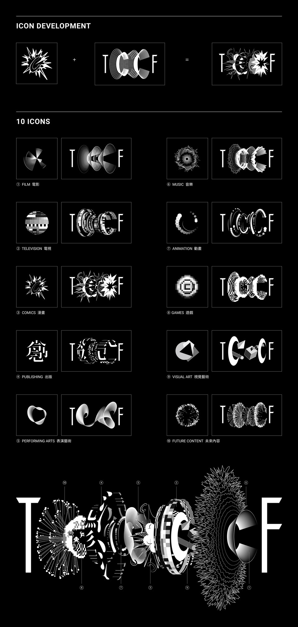
JL DESIGN excels at thinking beyond the two-dimensional, and when designing the logo for the first Taiwan Creative Content Fest (TCCF) held by TAICCA, they paid special attention to the logo’s transformation and evolution. Johan mentions that this project needed to showcase creative attitudes and cultural representation while responding to the proposition of “Taiwan to the World”: “Demonstrating that Taiwan stands in the world with excellent creative content industries while shaping its own culture. Therefore, the visual uses elements of ‘manufacturing and mold-making’: the two Cs in the middle become channels, like molds, producing different effects with different materials input.”
|Further Reading|
► Taiwan Creative Content Fest
Project Director Chia-Ying Tsai states that each logo carrier can be a starting point for entering the brand. TCCF’s exhibition content is diverse, posing challenges for design integration: “The visuals, experiences, and designs of large-scale exhibitions can easily have communication gaps, often due to multiple teams participating.” JL DESIGN collaborated with digital artists to create elements covering both static and dynamic aspects, making the TCCF logo not just a main visual but a system. By expanding the visual’s extensibility and inclusiveness, clients can freely use visual vocabulary to flexibly connect different carriers and media.
The logos created by JL DESIGN are no longer limited by frameworks such as geometry, angles, colors, or aesthetics. Instead, they focus on how to maximize the logo’s potential, breaking the traditional definition of logos, endowing them with more functions and deeper connotations, and allowing them to be widely applied to different carriers and channels, making the logo a suture point for the brand.
Insight
JL Perspective|LOEWE x JL Brand Strategy Planning
2024-08-22
Insight
JL DESIGN Perspective|What defines the key visual? Going back to basics, asking the right question.
2023-04-24
