JL DESIGN Perspective|What is a brand CIS? Make a challenging topic simple.
Date:2023-10-13

What is Brand CIS, Brand Identity System, and CI Design? Besides the explanations found in a Google search, are there other perspectives or approaches to understanding CIS, such as visualizing corporate culture, business philosophy, and corporate behavior?
Creating a cohesive brand experience to establish a comprehensive CIS.
A Brand CIS (Corporate Identity System) is a visual system that conveys a company’s brand image and serves as a crucial bridge connecting the brand with its audience. In an era where media and platforms are diverse, a brand CIS needs to be more thoughtful and flexible. For JL DESIGN, an effective CIS should make all touchpoints more systematic.
Project Director Chia-Ying Tsai explains, “We develop design plans and combinations tailored to the specific needs of each brand. Creating an appropriate CIS for our clients is our team’s continuous goal. JL DESIGN not only offers design insights but also systematically examines various touchpoints between users and the brand. We accompany businesses in planning the brand experience step by step, starting from the core.”

Exploring CIS, accompanying clients on their journey.
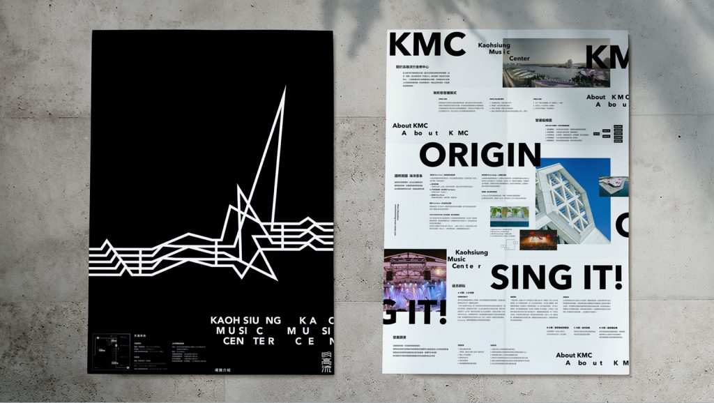
With the contextual consideration of different elements within CIS, mentioning CIS is no longer just a matter of simple answers like logos, standard fonts, and standard colors. From the extension graphics of a logo to the specifications and applications of an identity system, taking the Kaohsiung Music Center (referred to as “KMC”) brand identity system project as an example, we can observe the development and expansiveness of the visual system.
During the initial stages of the project, JL DESIGN team members visited the Taipei Music Center for interviews. This music venue shared some similarities with KMC but also had distinct differences. Through these interviews, the team was able to identify the unique characteristics of KMC and establish its symbolism based on cultural and field research. Senior Project Manager Ryan Lin emphasized the importance of this preliminary analysis, stating, “Designers should approach CIS design from the client’s perspective, not just as a creative pursuit for visual aesthetics. Design should have a clear understanding of the client’s issues and effectively convey the client’s brand spirit and philosophy.”
|Further Reading|
► Kaohsiung Music Center
As CIS evolves, the team’s roles have expanded beyond being mere designers; they have become partners in exploring the vision and mission with the client. The music scene in Kaohsiung is not limited to the Small Oyster Rock and Megaport Festival; there is also great potential for the development of local culture and industry values. Ryan shared, “When we look at the DNA of Kaohsiung as a city through its history, we find a place full of vitality, openness, and courage. Therefore, many diverse creative initiatives have a great opportunity to thrive here. The significance of KMC to the local community is self-evident; it will form an industry chain and serve as a cultural hub that carries the essence of the harbor culture.”
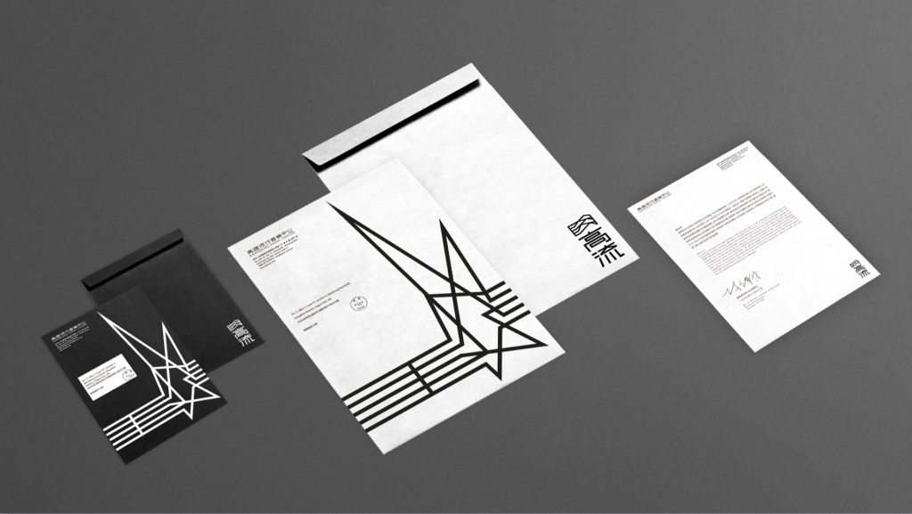
Initially, in JL DESIGN’s planning, the brand was defined with a black-and-white color scheme, which raised some concerns from the client about it being too monochromatic. The client inquired if a set of “secondary colors” was necessary. However, once the team had a sufficient understanding of the brand’s essence, they responded confidently, “The reason black and white were chosen is to accommodate a more diverse range of voices, just like the vast hinterlands of Kaohsiung, allowing various vibrant creativities to emerge. Your brand is exceptionally unique and doesn’t require excessive colors to explain itself.” Ryan shared, “During this process of accompanying the client in exploration, we also assist in building the client’s confidence and finding their brand positioning.”
In the end, JL DESIGN developed a distinctive typeface for KMC’s CIS, imbued with a sense of boldness and vitality, complemented by linear patterns symbolizing waves and musical notes. These linear patterns effectively capture the atmosphere of the port city and can be flexibly applied to various dynamics, occasions, and touchpoints.
Expanding Brand Touchpoints
The successful implementation and ongoing use of the KMC CIS depend on two key factors. First, it involves considering the future possibilities of digital applications for the brand: “We wanted to have a three-second jingle and design it as a set of patterns so that the dynamic visuals can transform and assemble.” When these brand variations are scattered across different platforms and themes, even with numerous versions, they still trace back to the same KMC theme song. Chia-Ying believes that the second factor relies on active engagement and experimentation by the client to allow the brand to permeate through various touchpoints.
Reflecting on JL DESIGN’s work for well-known domestic and international channels, Ryan said, “Channels have considerations for different time slots and demands based on different ad insertion points. To ensure that the channel’s image is consistently presented to the audience within the limited durations of 5 seconds, 10 seconds, or 30 seconds, it requires the team to engage in systematic planning and comprehensive thinking.”

Chia-Ying noted that past experiences have enabled the team to seamlessly transition between static and dynamic formats and rapidly establish a brand impression within the constraints of seconds. She said, “Motion graphic requires a combination of know-how from both static and dynamic realms. It necessitates a sense of rhythm and understanding of composition in the visual context, and one must consider three-dimensional space to excel in this field.”
Flexible Application of CIS, Assisting in Brand Integration Inside and Out
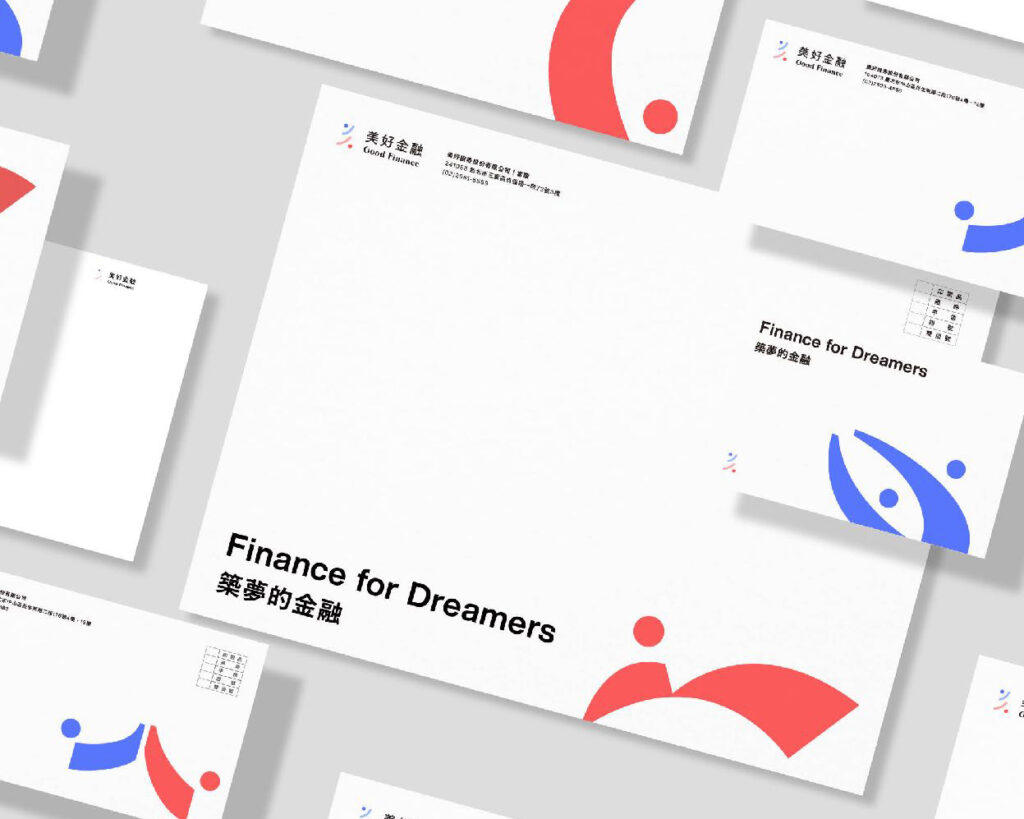
In this era of multimedia and fleeting attention, the team seeks visuals that can capture people’s attention and make them pause. Art Director Kevin Chien believes, “An effective identity system should be able to convey the brand message in the simplest way as the brand grows and evolves.” The upcoming discussion about the Good Finance CIS project is an example of this approach.
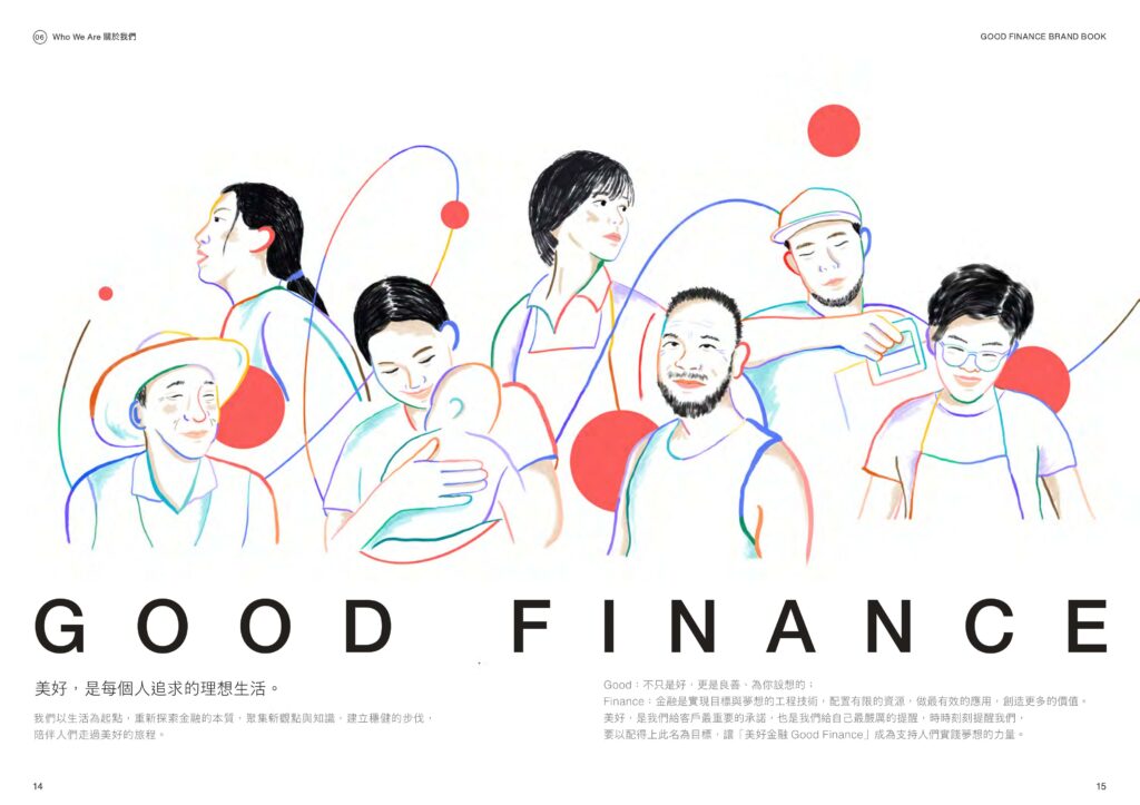
After completing the CIS, in addition to creating detailed guidelines that include color schemes, supporting graphics, and other specifics, Kevin places great emphasis on “creating communication.” He said, “I hope that employees who read the brand manual can gain a deeper understanding of the cultural values of the company and see from what perspective the company evaluates its own brand.” Through repeated readings and sharing, there are more opportunities for in-depth communication about the brand’s essence. “I want readers to start thinking about what ‘Good’ really means. I hope that everyone who receives and reads it can feel a seed sprouting in their hearts.”

In an era filled with change and diverse mediums, conveying a simple concept has become incredibly challenging. Kevin stated, “Only by returning to the core, back to the basics, and practicing the ability to articulate something completely, can its true value be realized.”
Therefore, the CIS tailored by JL DESIGN for brands is not just an external showcase but also a tool for fostering internal unity, aiding in the formation of consensus among employees. The team chooses to stand side by side with clients and think a step further, dedicating themselves to making the brand’s identity system more tangible to achieve maximum practicality while conveying the brand’s core ideals. Whether a client’s ultimate goal is branding or rebranding, JL DESIGN provides an excellent opportunity to assist businesses in achieving internal and external integration.
Insight
JL DESIGN Perspective|How Logo Design Concepts Create Brand Value
2024-08-26
Insight
JL DESIGN Perspective|What defines the key visual? Going back to basics, asking the right question.
2023-04-24

